RnD Summit, Shopify
Making the complex simple with a thoughtful brand system.
As a designer on the culture team, I’d often get asked to design team logos. People assume that’s the role of a designer on an internal team—to support employees with all their graphic design needs and be available to polish their presentations, especially over Hack Days. But I digress, with a quick clarification sidebar: I’m not opposed to team logos—they can help bring unity behind a common identity. It was just not my priority amongst the rest of my workload; if they went ahead and designed it themselves—great! The culture team does not own culture. Anything goes, so long as it doesn’t break Shopify brand rules ;)
I created team logos on one occasion. For our first-ever RnD Summit—an in-person event for everyone in RnD. In 2019 that was approximately 1,000 people.
The problem
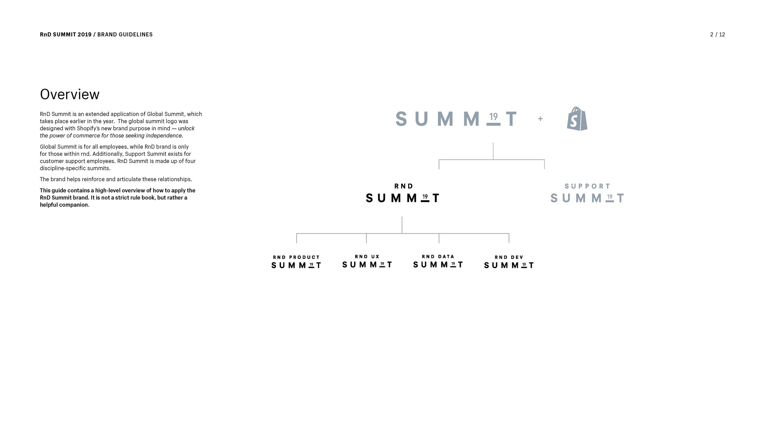
Without getting too deep into explaining the whole org chart, RnD was an umbrella term for Devs, UX, Product and Data. RnD Summit would hold four separate summits, one for each discipline, and all under one roof (with breakout sessions spread across the venue too). There were times we’d need to send out a communication to all of RnD (e.g. confirm your attendance), and others we’d need to send out discipline-specific information (e.g. summit itinerary). We would also need to create venue signage and wayfinding to help people find their way around the venue. It was clear that a sophisticated brand system would be required.
The system
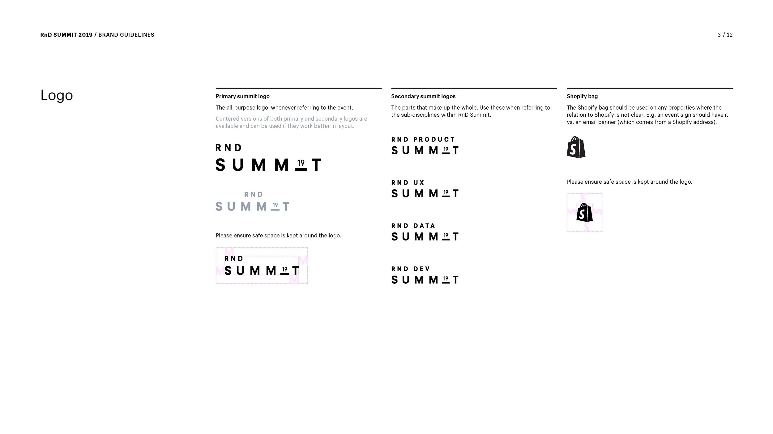
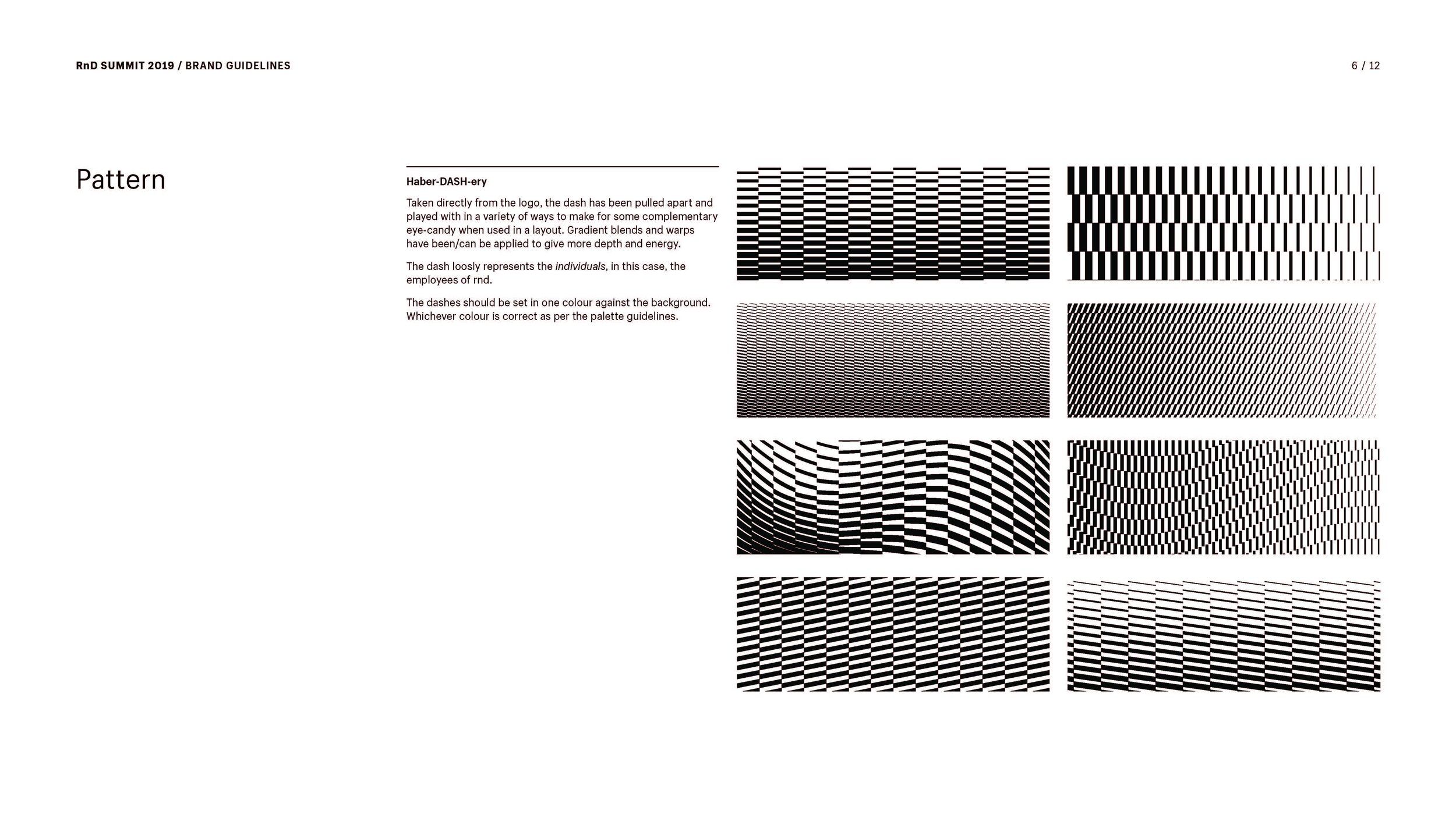
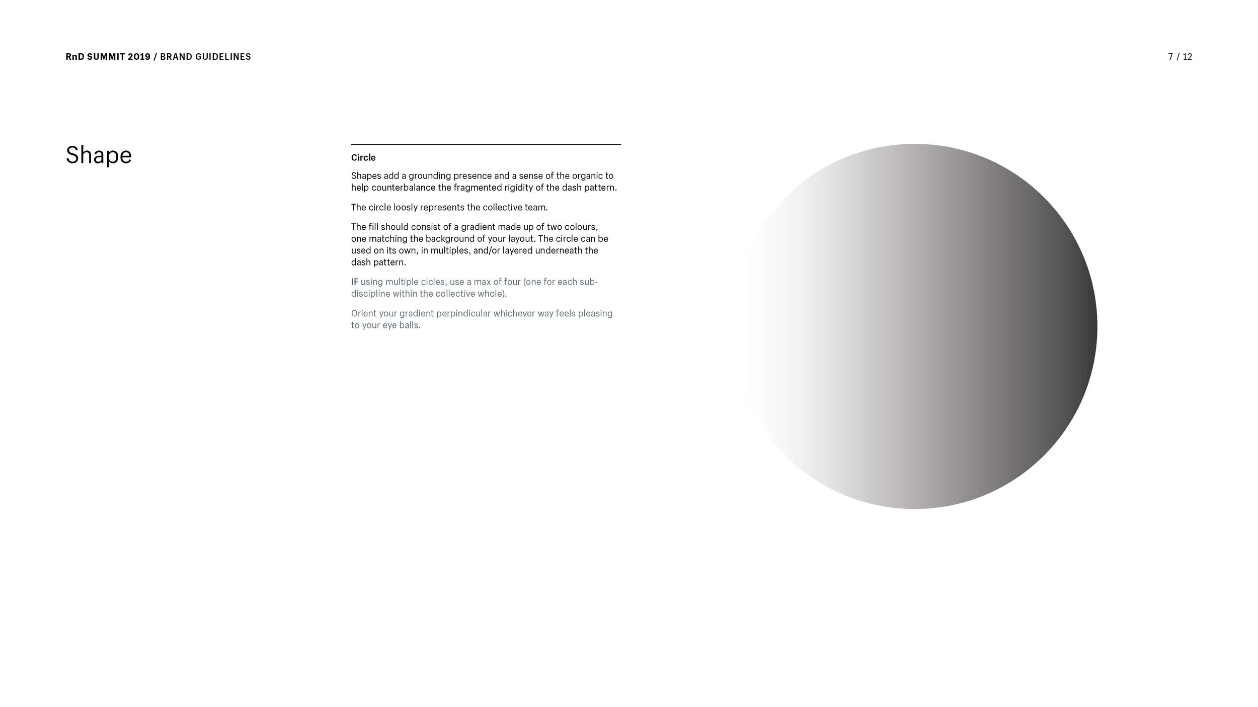
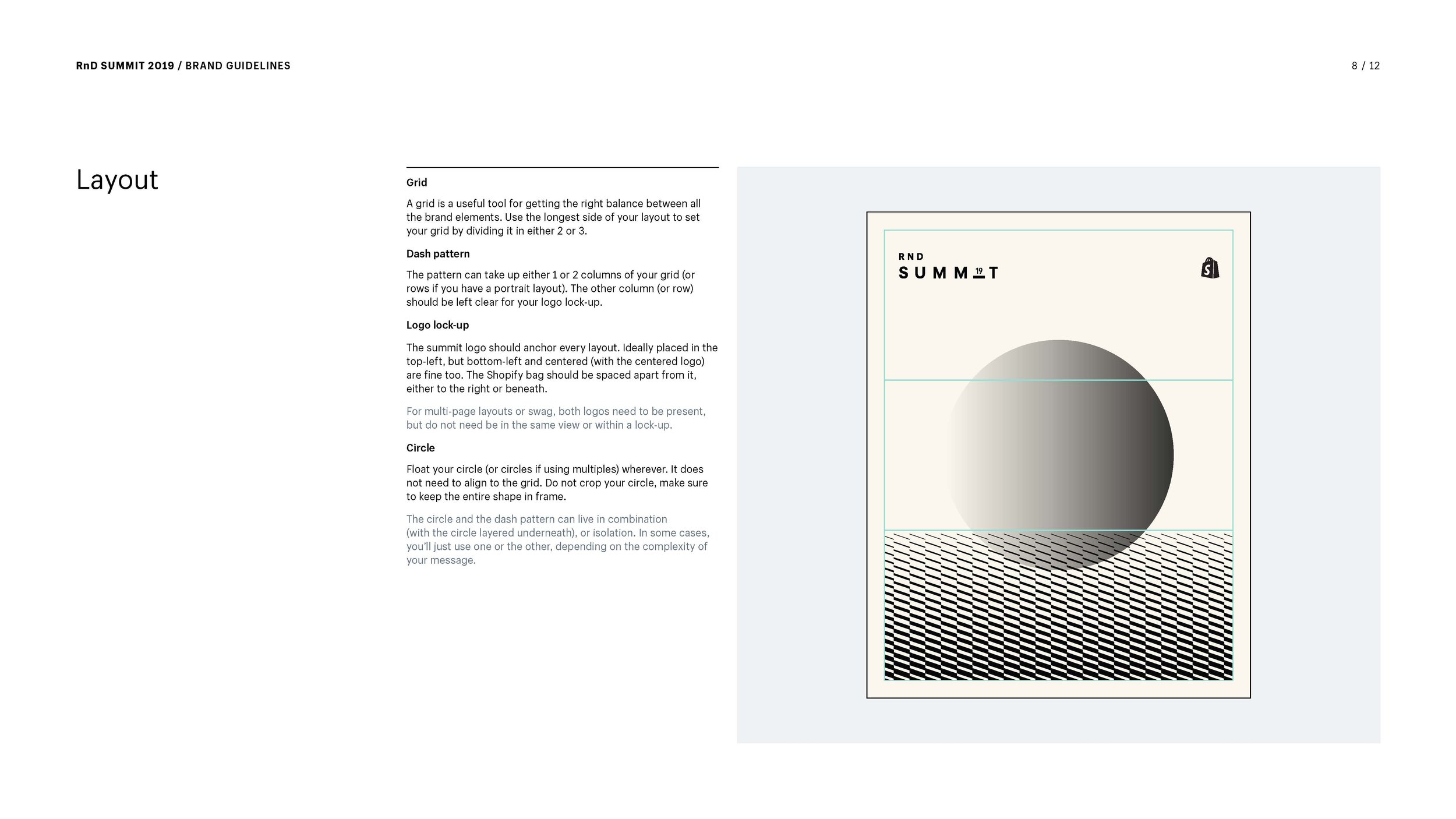
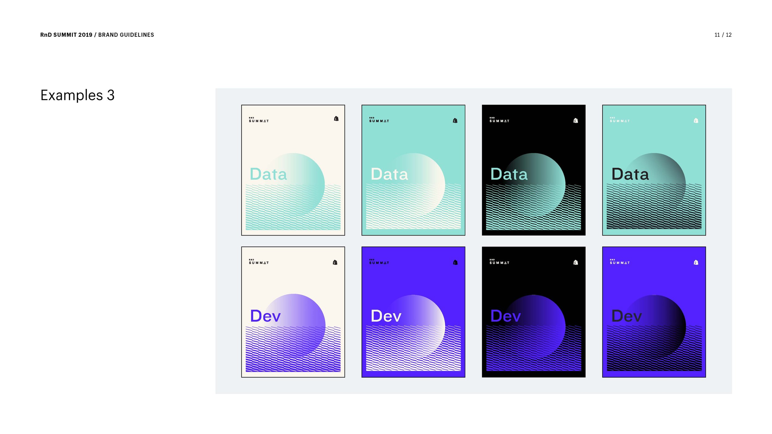
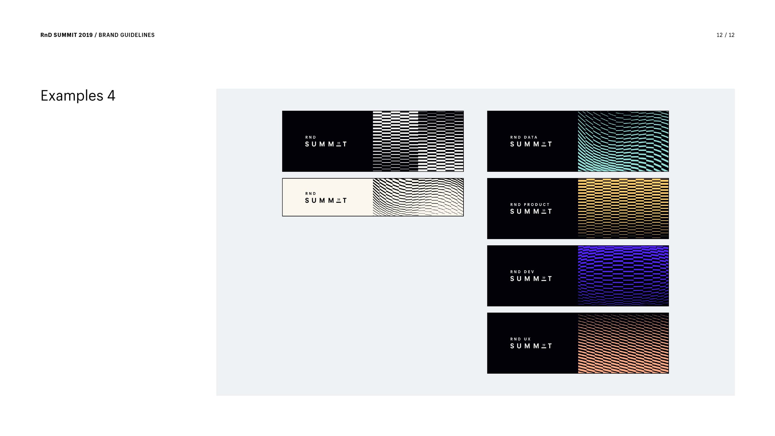
I established some unity in the wordmark and graphic elements. The sphere felt optimistic, futuristic and orb-like; the repeating dashes felt technical yet fluid. I could see them appealing to an RnD audience. I leaned on colour to help emphasize the different sub-brands, selecting one hue for each discipline. This brand system was no simple team logo. It had to feel intuitive to people—I didn’t want them to work to figure it out. I had to find a way to articulate it concisely and share my logic in a brand guide.
My roles
Art Direction
Visual design
Event design



Application
I worked closely in art direction with experiential agency Community, and Shopify program manager Kate Brennan, to pull off the daylong event, which included an epic after-party.
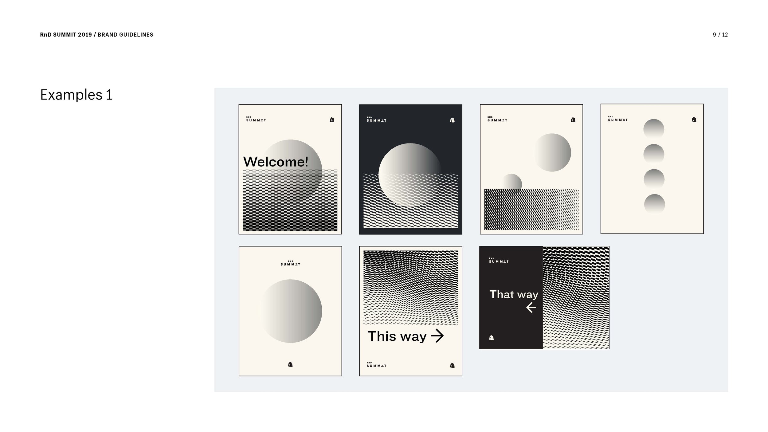
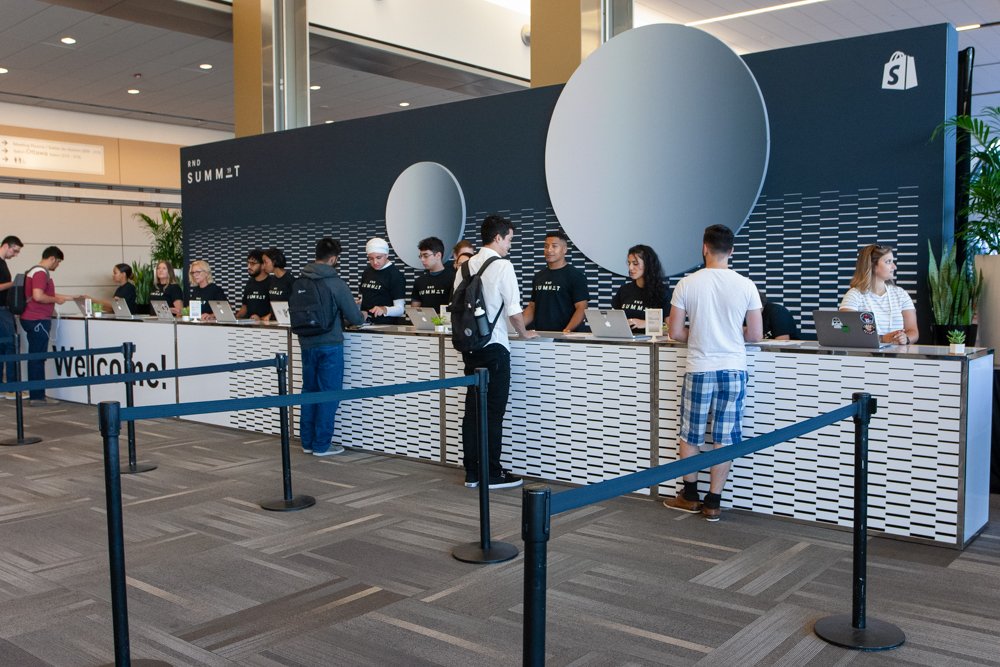
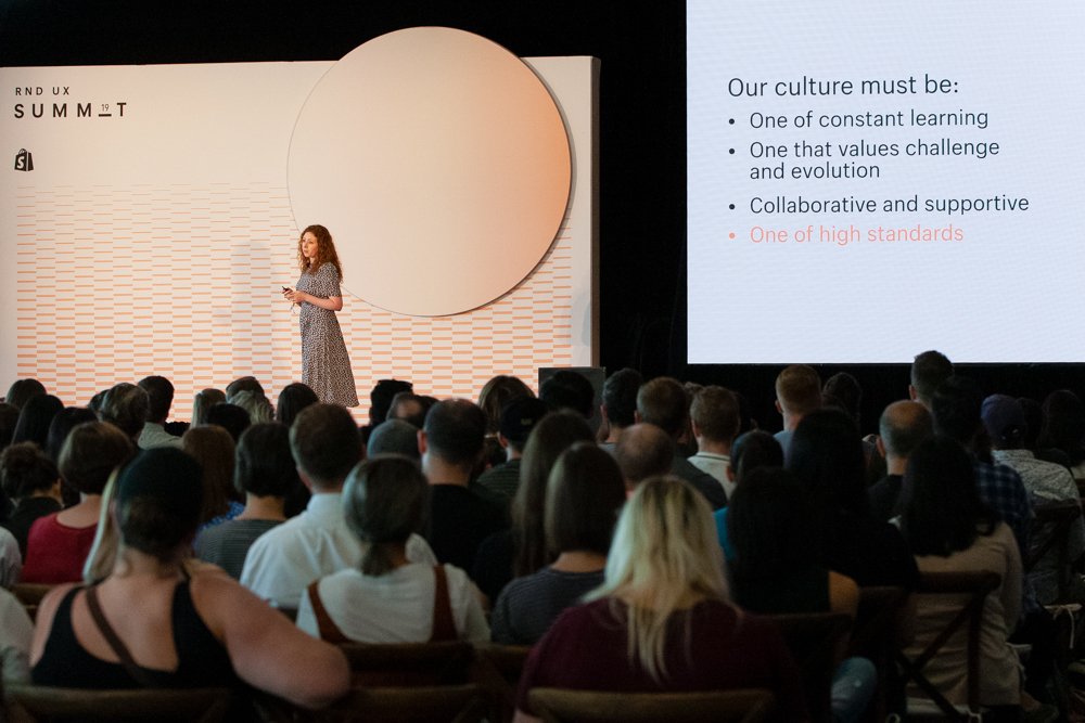
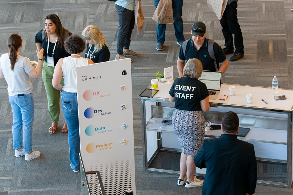
Common areas were RnD branded at the venue, while stages and workshop rooms were discipline-branded. Signage needed to be flexible as rooms were getting shuffled around on the day. We had people holding lollipop signs and velcroed arrows onto the wayfinding. Happy to report: no one got lost at the venue.
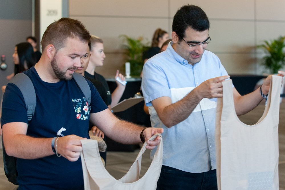
Shopifolk have come to expect killer swag with all our in-person events. RnD Summit was the first we sourced all of it from Shopify merchants (keeping the flywheel spinning). Socially responsible merchants to boot. I pulled together a Back to School-themed kit with RnD Summit's learning goal in mind. It included discipline icons—simple typographic treatments woven onto varsity patches.
Good design facilitates the messaging and provides the medium but stays out of the way. Shopify brought people from around the world together to learn from one another. Arguably, one of the most helpful tools I can provide is a solid Powerpoint template. Presenters are always top-notch at Shopify events, and content reigns supreme. The least glamorous, not to be underestimated, deliverable.
Discipline icons.




Read my next case study


